Consumers act out of emotion. Therefore, it is important that you have an emotional design on Email marketing. This is an ideal way to capture the attention of visitors and increase conversions, since it is a highly effective technique.
The general objective of marketing emails is to entice users to visit our page or take action as immediately as possible. Sometimes it can be difficult to achieve it but if you apply a good strategy, using all the necessary elements, you can achieve it.
One of the keys to obtaining the expected result is working with an emotional design. In this way, you can captivate leads and convince them to take the action you want. This way you can move forward in your thorough conversion process.
Emotional design: what is and how many are
When talking about emotional design, reference is made to a branch that works in email and web design. This focuses on offering stimuli that are capable of provoking an emotional response in the viewer. Which helps produce greater interactions with users and, in turn, contributes to generating more conversions.
For this reason, if you apply emotional design to landing pages, it will help you to optimize the user experience. It is a very effective method of getting their attention. In addition, it is a way to persuade the user to take the specific action you need: purchase, download, register, …

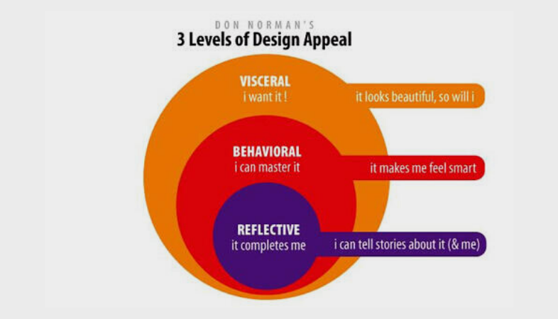
Starting from this concept of emotional design in landing pages, you have to know the different types or levels that shape it. These will help you to be clear about what you want to make people feel with your page. These are the 3 main types of emotional design:
- Visceral Design: This is a preconscious level, that is, prior to thought. This is often called the “first impression.” It is about the perceptible qualities of the object and the feelings they produce in you.
- Behavioral design: refers to the most functional aspects of products and services whose purpose is to optimize the effectiveness and quality of the experience.
- Reflective design: it can be said that it is the most abstract because it refers to the image of the person himself, personal satisfaction and memories. This type of design sees the effects of behavior when a product has usability problems.
Why use emotional design
It is important to know that through emotional design you can achieve better results that, specifically, become conversions. This is the main reason why it should be present on your landing page. In addition, it is an excellent way to connect between disciplines as close as marketing, images and emotions.
A study by Alan Branthwaite, entitled “How to Investigate the Power of Images in Marketing Communication: Evidence-Based Techniques”, demonstrated the following:
- Images have a more direct connection to unconscious feelings and ideas.
- Graphic elements have an immediate impact on receivers.
- They can be perceived holistically and not linearly or sequentially.
- Visual content can be perceived, and partly processed, preconsciously. This affects the impressions of people and places without them being aware of it.
As you can see, the emotional design on the landing pages plays a very important role and helps meet the conversion goal. Now that you know what it is and the techniques to apply it.

